Monday, 9 October 2017

Monday Catch Up.

Well I've been a bit tardy with the blog again, and have amassed a few rides since the last excitement filled bulletin here, so it's high time I got all tappety tap tap with the keyboard.

Thursday the 28th of September... blimey that seems an age ago, but anyway, we'll start there and lob up a few photos from some of the rides I've done.

That Thursday morning saw me peering out of the window wondering who had turned the contrast down during the night, turned out just to be a bit misty outside so need to panic then. Well yes actually, 'cos mist makes for some good photos, but first, coffee. Sometimes I can go without the jump start that is the first caffeine injection of the day, but not on that day. So it was, that by the time I had got brain and body functioning to a level compatible (just) with riding a bike, the mist was already lifting as the sun burned it off before my very (still slightly bleary) eyes.

Spiders must hate misty mornings as their wonderfully woven and cunningly crafted webs become so visible, even the most short sighted of insects buzzing merrily along can see the trap looming. 

Just a minute or two later on from the first webby photo up above and the mist is already clearing. Doh... Late to the party again! 

It wasn't long at all before all signs of the murky start had been seen off by the sun. This image makes things look a tad bleak - a result I think of the still damp roads, the recently cut hedges and verges. Oh and me turning up the contrast a bit in post processing to make it look half way presentable as an image. In fact it was a rather pleasant, warm and sunny day that unfolded.

Right, I'm hitting the fast forward button here and missing out a ride 'cos not a lot happened worth putting on here.

So we suddenly get to last Friday, October the sixth, and a beautiful sunny day once again. Now a sunny day means it's ride the Marin day, so out came the Pine Mountain and off I booted, being careful to avoid puddles and mud as much as I could, the Marin being my 'best bike' as it were, and the one I really hate getting dirty. Trouble is, it's such a good bike to ride it's hard to keep it for summer use only or something daft like that, but with some careful weather watching and even more careful dollop dodging riding, I can ride it and keep it from getting ruinously grotty in the process.

An absolutely beautiful day for a ride in the countryside. Warm, soft, sunshine and no wind to speak of (meteorologically derived wind anyway, no such assurances can be made regarding the old bloke in this photo).

Between the hamlet of Boswiddle and the ford. I'd be going past that farm on distant hill over yonder later.

Boswiddle Ford... again. I can't pass through here without a good poke around, and of course, a photo or three. It is a magical little place for me, somewhere I always enjoy stopping and just taking in the noise of the water dropping off the road onto the lower level of the stream below, and the squawking of the Crows in the tree tops here.
This was taken using one of those very cheap and crappy mini tripods that was a freebie with, I think, my Canon G7 when I bought it. The sort of crappy little thing you'd find in a pound shop no doubt, but it actually does prove useful on occasions such as this, when a low viewpoint and a long exposure are required. The G1X boasts a lot of gravity for a compact, being quite a chunky number, but the little tripod holds it well.

Just cruisin' along.

If only I could bottle the waves of calming pleasure I feel sometimes when riding through scenes like this...

Oh hold up, what's this? A Covey of Pheasants, a Nide or a Bouquet of Pheasants no less. Suggestions all for the collective noun for these equally magnificent but dim, birds.
I'd suggest a Mayhem of Pheasants, a Chaos or a Pandemonium perhaps, as being equally, if not more so, suitable.
There are three of the beggars lurking in this photo, as they took the sun on a fallen tree in the woods near Trendeal.

I've tried before, but failed spectacularly, to get a good photo of a Pheasant or two, but these for some reason, seemed quite happy with me being nearby. I say nearby, but they were still a bit too far for the compact's zoom lens, so out came the big guns - the 450D and the 55-250 zoom, rather than a Purdey side-by-side, much to the relief of the feathery ensemble no doubt.

The only reason I can think of that these birds didn't scarper quick on my arrival was that possibly, they couldn't actually see me due to the sun being in their eyes. Or, if they are escapees from the pens and guns of the local shoot, maybe their survival instinct hasn't been formed yet.

The turning colour and dropping of the leaves can mean only one thing - it's that Pheasanty time of year again, and sure enough, the lanes have suddenly become full of the beggars again after the quiet, tranquil, summer months. Hardly a ride goes by now without me being startled by some gert big bird, or birds, busting out of the hedge beside me and running up the lane ahead of my advancing knobblies. They dodge left, they dodge right, making that awful cluuuurching noise as they go, before finally remembering they can fly, well after a fashion they can anyway. So they take off, but instead of soaring gracefully upwards and away to safety, they veer to one side or other and crash alarmingly through the bushes, leaves and branches bustling as they go, and I wince at the thought of the battering the bird must take in what usually would qualify as an air accident worthy of the AAIB's attentions.

Not the brightest of birds by any means then. Not intelligence wise anyway, but colour wise, their markings really are quite something. The area below the vicary looking white collar and down their backs looks for all the word like it is painted in acrylics or something. Those long tail feathers are quite superb too.
So I think it's a shame they are seen as good shooting fun. I don't like hunting for shits and giggles in any form, but I fail to see the sport in shooting Pheasants. Take a large, slow moving and even slower thinking bird, and blow it to bits with a gun that could hit all four corners of a barn door from 30 feet with a single pull of the trigger. Where's the skill in that? Let's see you nail one with a sniper rifle then I'll be more impressed with the marksmanship, and the poor dim bird will at least stand some chance. Easy for me to say all that mind you, I've never fired a gun and probably couldn't hit the sea from a rowing boat if I tried to fire one, but still, it doesn't seem overly skilled to me.

But, Pheasant numbers in the 'wild' are on the rise apparently, and it is the shoots that we have to thank for that, as numbers bred in captivity increase each year, leading to the inevitable lucky escapees taking up residence in the countryside, albeit devoid initially of self preservation and foraging for food skills. 

So well have their numbers grown that a recent University of Exeter study found that Pheasants make up 38.1% of birds killed by traffic between 2013 and 2016, the highest number of any roadkill bird species (Pheasanty slaughter). I've personally nearly added to those figures myself after having had a couple of very near misses with the blundering bird while out riding. But despite all the startle induced wobbles and undercracker laundry traumas, I'm a fan of the darned birds. Thick as a yard of gravy they may be, but a ride in the countryside just isn't the same without their catastrophic presence. It was too quiet this summer so I'm glad the shooting season is underway and may as many Pheasants escape the guns as possible.

Riding on having bagged some shots of the Pheasants, I saw some far more graceful feathered flying courtesy of a couple of Raptors that swooped out of the tree tops and soared up the lane in front of me. It turns out they had spotted a Rabbit or Hare that I then saw floppeting up the road and I braced myself to witness the kill, only to see a car come round the bend ahead, the Rabbit (or Hare, can't tell the difference without my prescription glasses on...) dive into the hedge, and the birds swoop to the right off over the adjacent field. 

I've had many encounters with Raptors over my cycling years as well, and they are altogether a more special moment than encountering a floundering Pheasant. I need to take my NHS specs, binoculars and big zoom lensed camera, and stake out a couple of the places where I regularly witness the effortless flowing soaring of these birds of prey. Oh and a Raptor ID book for idiots would be handy as well. 

The Cornish Space Agency have got the launch pad sorted, now they're just searching Ebay for used Saturn Fives and there'll be Trelawney men fair and true in space before you can bake a big bloke's pasty.
Alternatively, this may be a BT phone mast I've heard about, near Carland Cross...

Sunday, yesterday, the 8th of October, was Fatbike Sunday once again, and another ride into Idless Woods.

Not Idless Woods, but a scraggy raggy bit of woodland nearby, atop the nearside hill above Lanner Mill.
I love these bits of 'wild' woodland that dot the landscape. I desperately want to get in them and immerse myself in their disorder, but they're all privately owned by some bugga or other, and most are protected by walls, fences, signs saying 'beggar orf,' minefields and watch towers etc. The woods I do get to explore seem almost too well managed in comparison, almost as if Disney did woodland. These raggedy bits provide reminders of what the countryside could've looked like centuries ago before we started tarmacing and concreting, and organising and controlling everything.

I started off poking Fatso along the middle path through the woods, as seen here, but was soon seduced by a 'new to me' path down through the trees.

Boldly going where Fatso and I had not gone before, and most enjoyable it was too.

Close up of some twisty Idless bark.


I must admit to not always being a fan of the long exposure treatment given to moving water. It seems such a cliche these days, every (white) water  shot you see looks more like smoke than gushing wetness, and the result is also not how we see it with our MK1 human eyes. But... I'm slowly changing my mind and experimented a bit with some longer exposures beside the stream in the woods. Too long an exposure and I got the smokey effect which left me not overly enthused. But the second shot of these two above was a bit quicker at 1/10th of a second, and is a half decent compromise, conveying the movement, power and maybe even the noise of the water here. The smokey look, to me at least, never portrays or suggests the noise that accompanies these mini waterfalls.

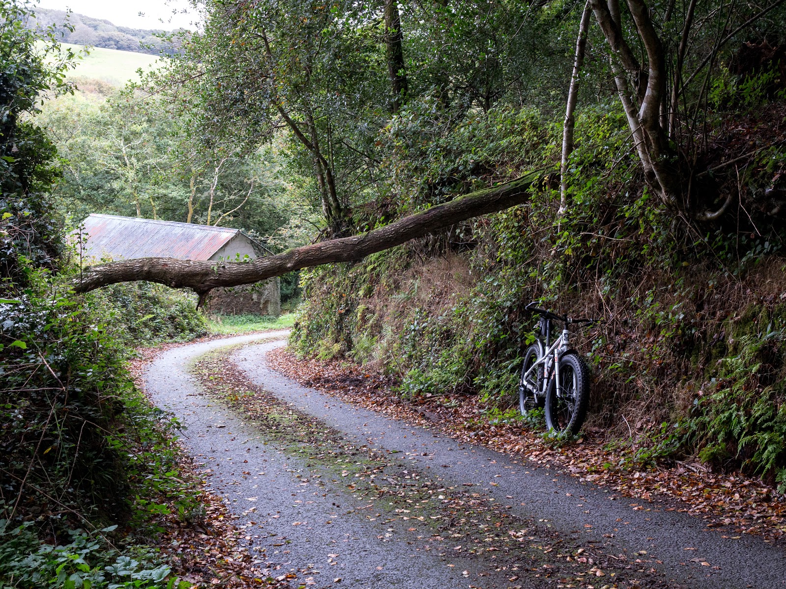
The original plan had been to do a loop of the woods then beggar off back home in time for lunch, but I changed my mind, enjoying the ride as I was, so took the long way home from the woods, via the road. This meant descending back down to Lanner Mill (where I'd entered the woods) but my bimbling was nearly interrupted by this fallen tree. On my side of the road, the left in this photo, I would've banged my head a treat (but missed my brains by about three feet), had I not seen it and been able to stop. Just as I stopped, so a Ford Fiesta came down the hill behind me and just squeezed under the tree by going to the right side of the road. Anything bigger would surely hit it so once I got home and could use the internet (my mobile phone doesn't do internet... actually it doesn't do much at all, it's a phone, for making phone calls with) I found the contact details and phoned it in. 
This lane is a cut through for people travelling to/from the north west side of Truro and wanting the A39 towards Newquay or the A30. This lane gives Truro and its traffic a swerve, so you do get all sorts along here,  and sooner or later, a4x4, a motorcyclist or a van would no doubt twat this tree a good'un, it being a steep hill and a bend an all.
I got an email this morning saying the tree had been cleared so all is good (hope it was done yesterday just after I called it in mind).

So that's the news from down here in Autumny Cornwall. 
I'm rushing to finish this post now, 'cos there's live Speedway on in a mo and we're getting near the end of the season so I want to get my fix while I still can. I won't be spill chocking this until later either, so it might be fill of mistooks and bad grammarisms, but it'll have to do for the time being.

Right, until next time, happy bimbling!

Sunday, 1 October 2017

The Sin Bin of Shame - Sterile Magazine Covers.

Time to unlock the door on my Sin Bin once again, my version of Orwell's Room 101, and lob some unsuspecting, and to be honest, probably undeserving, section of cycling in, with a swift kick up the bum for good measure.

So what's been getting on my pip lately then? Magazine covers, as if you hadn't guessed from the title of this rant (for that's what it is under the cunning disguise of the Room 101 subterfuge).

I always thought the idea of the cover shot was to grab the attention; to catch the eye of those who follow the same interest as the magazine's subject and win them away from rival publications on the newsagent's shelf. Some magazines in the world of cycling obviously do use some superb imagery on their covers that immediately grab the eye and usually invoke a certain level of curiosity and also jealousy - Woo I want to be riding there. They have a certain dynanininism dynamic about them that means that stood there in someone's way in WH Smiths, you can smell the air, feel the wind rushing by and wish you were out on your bike instead of killing time on your lunch break.

Some though, to my eyes at least, don't.

Now I'm no media imagery expert, I speak from vast inexperience of the matter, I'm just an old bloke who likes bikes and photography (doesn't mean I know anything about either mind you) and reads far too many magazines for the good of my bank balance and the world tree population.
But ever since I was a kid the photos in whatever magazine I'd been reading were always important to me, I always examined them closely - the composition, the setting, how they relate to the subject, all that blah, and also the effect they had on me. Generally if I wished I'd either taken the shot, or been in the shot, or preferably both, that was good. Or indeed, if I just mouthed 'Wow!' then the photo was a good'un in my book. Or magazine. I'm a simple sort, some folk probably want a photo to speak to them far more, but for me I'm happy that those feelings I've mentioned will do me nicely.

So it bothers me somewhat when I see what I consider to be pretty dull and uninspiring photos on the cover of a magazine - why would they do that? That looks proper pants! and so on. The answer to the first question must be that the photos do work for them, otherwise the mags in question wouldn't keep on using them, but it puzzles me for sure.

Well enough wittering, we'd better have a look at some then, and be warned, there are a lot of covers coming up, shamelessly nicked off t'interweb, and so also all shapes and sizes, as I can't be arsed to resize 'em all.

Now here, to me, are the chief culprits:


 Bloke on a bike, with a hint of background in it.

 Bloke on a bike, not looking happy. Maybe it's the cross wind blowing him off his bike, or is he just giving it large with the side to side climbing action? Regardless, cheer up mush, you're making me miserable...

Bloke on a bike, looking like he's a tad chilly perhaps. Not surprised wearing that get up, he should've worn something more sensible like proper trousers and a nice warm coat. Silly man.

Ah now this one really burns my toast. This has to be just about the most undynamic and sterile shot you could have. An utterly ghastly background colour behind a bloke sat on a bike. The headline articles are 'Your best ride ever' (what in a photo studio?) and 'Cheap thrills' (bikes so cheap you don't want to be seen outside on them?). Whatever, the only emotion this cover provokes in me is 'what a load of toot that cover is - zero shits given.'

That title isn't the only one guilty of cover crimes though...

 Bloke on a bike but in its favour it does show a rather attractive background and convey an impression of speed, so it's not a complete fail for me, I'll give it that.


 Bloke on a bike and it also gives a hint of the environment the rider was in, but somehow it still comes over as being rather insipid. Maybe it's the lighting, or the fact it has a faint whiff of Photoshop about it (even if it hasn't been fettled, it still looks like it to me). How can "Fresh, Fast & Fun" look so... dull?

 Bloke on a bike and again it somehow lacks emotion despite that background.

Bloke on a bike, again. What about the girls eh? Women ride bikes too you know! But this cover shot isn't quite so bad as that background does convey a hint of the pleasures to be had from riding a bike, but all these covers just look the damn same - a bloke on a bike. They all, to me, lack passion for their subject. 


Now, you may have noticed all those covers are from road bike orientated magazines. So does that mean roadies are a soulless bunch, only interested in the bike, and what socks to match with what sunglasses? Are they too wrapped up in measuring their FTPs, logging their KOMs and max wattage outputs to enjoy the sheer pleasure of being out in the big wide world, enjoying the thrills and freedoms of riding a bike? No, not as far as I know anyway. Sure some roadies are all about the data, but most are into riding for all manner of reasons and enjoy pretty much the same things as most of the rest of us, they just don't wear so much while doing it.

Why do they not feature more women on the covers though? Are they scared they'll lose half their readership in case the manly roadie doesn't want to take it to the till lest it be mistaken for a women's specific magazine? I doubt it. Plenty of women ride road bikes from what I've seen, and maybe these mags do cater for them inside, but it wouldn't hurt to have a female on the cover now and then, or even a bloke and a girl out riding together, maybe even... gasp... appearing to actually enjoy what they're doing.

I have bought a couple of issues of both the above titles in the past. Erm... yeah. Cycling Plus was alright, but seems to be a proper template jobbie, much like a lot of the photography mags these days. Best move on quickly before things get messy...

Ok... let's see some better examples then. 

 Whoa! Check that view out... Bit chilly looking mind you.

 You've got to love the Alps. I've not ridden a pushie in the mountains, but have ridden in the Alps on motorbikes many, many times, and it is a truly fantastic experience.

 The World's Hardest Climb? No kidding! Look at 'im will you, he's above the flipping clouds, the nutter! 
A simple photo, but what a place to be...

 I dunno about climbing that road, looks like hard work to me, but who wouldn't enjoy going back down it? (unless it is raining and you're not on disc brakes perhaps).

'The Thrill of the Ride' is right with this magazine I would say. The cover shots, and those inside too, as I have bought several copies of this mag (very good it is too, but I'm not a roadie so it's an occasional read for me), really make you want to go out on your bike and get riding, even if it isn't up some mountain or other. 
You see, a roadie magazine can look enticing...

 Yorksheer's best bloody riding and no mistake lad, there 'tis on t' front cover tha' knows, and reet pretty it looks too 'n all.

 Another simple looking cover but the environment is included by being in focus, and the riders are more part of the scene. Morning sun or evening? Who cares, lovely road to be on.

More of the same, although it is another bloke on a bike, but rather than gurning with effort this bloke appears to be drifting through the Jockwegian landscape casually, enjoying the warm sun and some carefree miles. And why wouldn't he be enjoying it? Just look at where he's riding!

Well so far we've looked at roadie stuff, what about mountain bike titles then? Well pretty much universally, they are a bit better...

 MBR is a 'mainstream' mag, but has less of the 'magazine publishing by numbers' feel of one of the top selling roadie jobs above. (Top selling eh? Those boring, uninspiring covers can't be too detrimental then...) 
This shot above is a reasonably simple looking one, not much in the way of countryside, but it still has a dynamic feel to it, there's the feeling of speed and movement, as well as fresh air. The rider doesn't look posed like on some of the duffer road covers.


 I think that bloke on the bike is Alan Muldoon, who strikes some of the most extreme photo shapes you'll ever see - elbows, shoulders knees, hips and chin going in all directions... If it's body shapes you want, then this is the mag for you, as the headline on the cover clearly states. 


But again the image conveys movement, the rider is to one side of the frame so has room to move through it rather than being smack in the middle as in the roadie mags. That movement might be enhanced by using second or rear curtain flash which gives that odd looking blurred but also sharp quality to parts of the image, but it's still a good action shot.


 It's not about the bike, it's about the riding.

Another shot similar to the Muldoon cover above, but it still got far more going for it than some of the staler efforts on the shelves. A nice Autumnal feel to the shot, as befits an issue advising on how to cope with the onset of winter, you can almost hear the leaves getting kicked up as pyjama shorts there rockets past the camera.

 The US title 'Bike' is a favourite read of mine due to the general 'real world' articles (it's not all youngsters with their arses hanging out their jeans hanging upside down in the air over some jump or other) and the excellent and atmospheric photography. Looks like a woman on the cover here too as befits the apparent contents.


 I'm sorry? Oh yes, who wouldn't want to lose themselves in that chunk of scenic splendour ?

 Some of these cover shots are a few years old, they're just what I found on the web quickly, but this one above was the first issue of the mag I bought, and the cover shot played a part in the decision to buy, it's something I can relate to and want to know more about - I want to read and see all about riding in that location!

An American mag with an immediately recognisably British cover shot. Bridleway heaven!

 Ah now, Singletrack is my favourite UK read-time treat. Once again, it's real folk riding wheels on the ground in real countryside, although mostly on high end stuff it must be said, but for me it's the best of the UK bunch, although a couple of others that I haven't yet featured here do come close) 

 Once again, it's not all about the bike, it's about the riding.

 Humid looking day...

 Misty, damp woodland - lots of fresh smells, drip, drip, dripping sounds and slippery wet roots to soil your undercrackers. Girl on the cover too. Singletrack has women on the staff so they often feature on the covers as well. The roadie mags I malign nearer the top of this guff may well have featured women on the covers, I'm just yet to see one of them so I'm happy to be proven wrong.

 Woo... fresh mountain air...

 Now these Singletrack covers are the subscriber editions, and therefore free of wordery advertising what's going on inside, so you get a clutter free image to enjoy, particularly as the image also extends to the back cover, so you can open the mag up, hold it out in front of you and go 'wowza!' There is a lot of thought going into these covers that I highlight as being the better ones, from all the various titles above.
But just look at the cover shot above - serious ride envy going on here, I want to be there, right this minute!

And this being Autumn, here is the latest issue, due out this week. All the fun, freedom and fresh, leafy, smokey smelling air of Autumnal mountain biking captured in one shot.

So are there any properly duff covers out there that might actually put someone off riding?

Well Sportive riders can be a masochistic bunch, but this looks like hard work to me, and the rider doesn't look like he's having too much fun either.

Hmmmm... busy main road, steep bits ... my idea of hell... Whoa yikes! Fashion crime! White rimmed glasses and a white helmet... Oh I hate that combo, it's just me and my prejudices I know, but there's something awkward and gawky looking to me about white rimmed specs and matching bonce potty. White over shoes too.. almost as bad as dayglo yellow ones like matey at the back. Actually, over shoes, when worn for anything other than keeping rain out, are a crime in their selves. 

Oh ok, those last two are shown with my tongue planted firmly in my cheek, they're not really off putting, except to me.

Now the trouble with all this is, as I mentioned above, one of the most heinous perps of cover crime is also one of the top selling mags, so the lack of imagination shown can't be hurting their bank balances too hard, and maybe the cover shot just doesn't matter to most folk (and it is what's inside that counts of course) but like with estate agents and their almost complete lack of 'getting' a good feature shot to grab the eye, I just don't get it.

Maybe, the bland cover shots are just the result of the modern mainstream publishing industry and their methods - template publishing. Doesn't matter what the topic, we own thirty gazillion titles from Embroidery World, to Frog Tickler Monthly and Roadie Fashion, and they all sell well using this exact same template, so all you do is fill in the gaps with photos here, here and there, and words go there. Minimum effort required, imagination not wanted. Crack on.

I have read, as I say, some of the popular road mags, and they've all (bar 'Cyclist') left me underwhelmed. Informative to a fair degree I suppose, but ultimately free of character, obvious passion for their subject and individuality, at least that's how they come over to me. Their sales figures suggest I am probably in the minority with my views, but there we go. Who knows, maybe their sales would be even better if they just tried a little harder and got away from the 'bloke on a bike, dead centre, expressionless body language, shallow depth of field to isolate the rider from the surroundings, flat looking, bland as possible image.' Maybe for them though  it really is all just about the bike.

Cycling, whether road riding or mountain biking or commuting even (Urban Cyclist mag has some good cover shots that convey the subject nicely) isn't a bland experience at all though. It's full of effort, colour, movement, fresh air, enjoyment and excitement. Try some tracking shots of a roadie leaning into a tree lined bend or something, how about a point of view shot from over the bars of one bike looking at another roadie just ahead leaning into a bend? That kind of thing. Use slow shutter speeds to convey a bit of speed and put the viewer where they'd like to be, out on the road on their bike and not in a stuffy newsagents in some dieselly aired town centre. Portrait configuration makes harder work for the photographer, but other titles manage to convey so much more within a vertical format, so it can be done.

In their favour, those Bloke on a Bike cover shots are easily identifiable to the potential buyer looking for a road cycling magazine - no time wasted hunting for the cycling section on crowded shelves, its location is visible a hundred yards away and the buyer will probably home straight in on the mags clearly showing a roadie in his full lycra clad glory. But are we buyers really that shallow that we need to be so easily led to what we think we want?

Mags not mentioned above but that are on my must read list are 'Cranked' which is a belting read, and features great photography inside, but the plain countryside cover shots I must admit, leave me cold, splendid though that countryside is. 


Cranked is a quality read alright, but the cover images just ain't putting jam on my scones. A bit more variety each issue might not hurt, but I still buy it though, so all this guff about cover images could be a right load of tripe! 

Another mag I've recently bought is only one issue old, and that is Sender. As the name suggests, it's more aimed at those folk who spend nearly as much time airborne as an overworked Ryanair flight attendant. The cover shot is an excellent one, no doubting that, it's some loon in a bright green romper suit in mid air above some rocky terrain, one handed and with his bike horizontal. 

Sender is a print mag only available online I believe, so not to be found in the newsagents.
The style of riding isn't mine at all, I'm far too old and scare far too easily for all that malarkey, but it is a quality magazine and I will be buying more. The cover image is a great one too, bound to appeal to those riders who do get their kicks getting 'rad' and honking their loam and so on. Like all the good mags I've mentioned, there's been some considerable effort gone into it, along with obvious passion for the subject and a desire to produce something of quality and worth having.

I haven't mentioned MBUK, and their covers aren't too bad, but they always have some free gift or other nailed to the front making the cover shot rather unclear for these purposes. They do lean towards filling the frame with bike and rider though, albeit in full on hoon, going for it plenty, action.

Well that's about it. So that's crappy, unimaginative, same-every-month, template driven blandorrific cover shots well and truly off my chest and shown the door to my Sin Bin. 

Time for some disclaimers.

All opinions are my own (well of course, who else's would they be? Duh...) and therefore likely to be deeply flawed, not to mention 'orribly biased. 

I fully admit it's easy for me to sit here and criticise, and if someone rang me up and said let's see you have a go chummy, I'd crap my myself, but I'm not a pro magazine type, paid to do as outstanding a job as possible.

All images shamelessly nicked off the web so my apologies to those I mention as being good examples, I hope you see my crime as a way of paying a compliment, and a big raspberry to those I moan about.

---------------